
Elegant Wedding Color Palettes That Photograph Beautifully
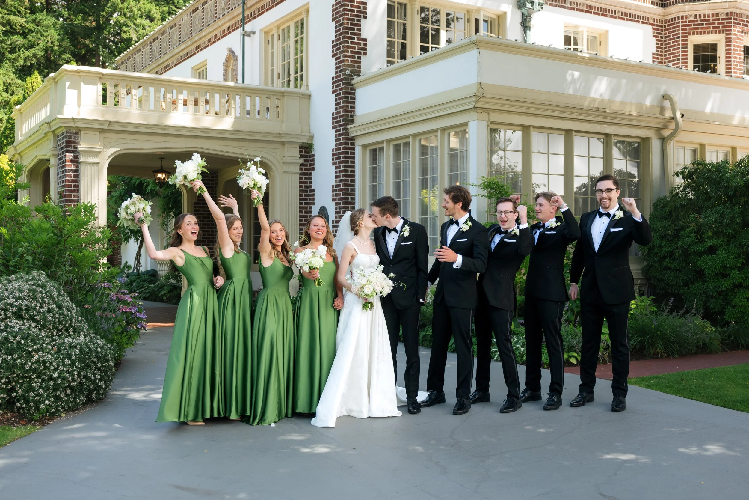
In wedding photography, we pay special attention to color. This is an essential detail that determines the final outcome of your bridal photos. So, it is crucial to know how to select your main color – the one that lingers in your memory long after the last guest has left.
As a wedding photographer, I see every elegant wedding color palette as its own little world. For couples who love effortless sophistication, choosing your colors is about more than the day itself. You should take into account that the color you pick will affect how you feel every time you open your album, whether that is next week or twenty years from now.
Simply put, color does not just decorate your wedding but shapes the emotion, the energy, and the story you will hold onto forever.
However, you should know that the palette you see in real life will not look the same in photographs. For instance, a blush that dazzles in the sun might vanish under twinkle lights, or beige that seems plain on a fabric swatch can absolutely glow on camera.
That is why it is important to talk to a professional and see what works. I have seen different elegant wedding color palettes work their magic, so I can help you decide what will bring you the effects you want in your photos.
Below, I have shared some insights that may inspire you.
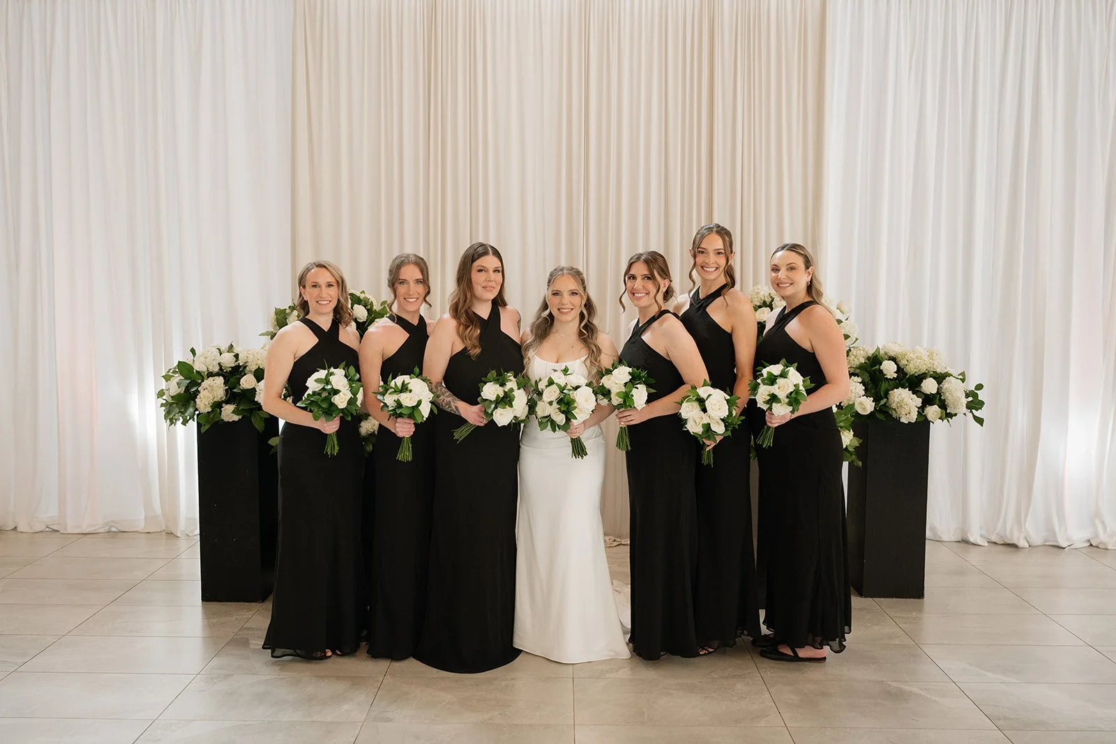
Palette 01: Black & Ivory
If you love a bit of drama – the chic, editorial kind – soft black with ivory might just be your dream classy wedding color scheme.
Nonetheless, do not take into account true black - that would be quite dark for your wedding photos. Instead, think more like the deepest charcoal, paired with warm ivory.
Once you have this combination, you can expect magazine-worthy portraits that feel sharp, modern, and unmistakably luxe. I see this shine at city weddings, garden spaces, or anywhere that calls for a little extra edge. If you want to add a complimentary pop of color, try a deep olive green!
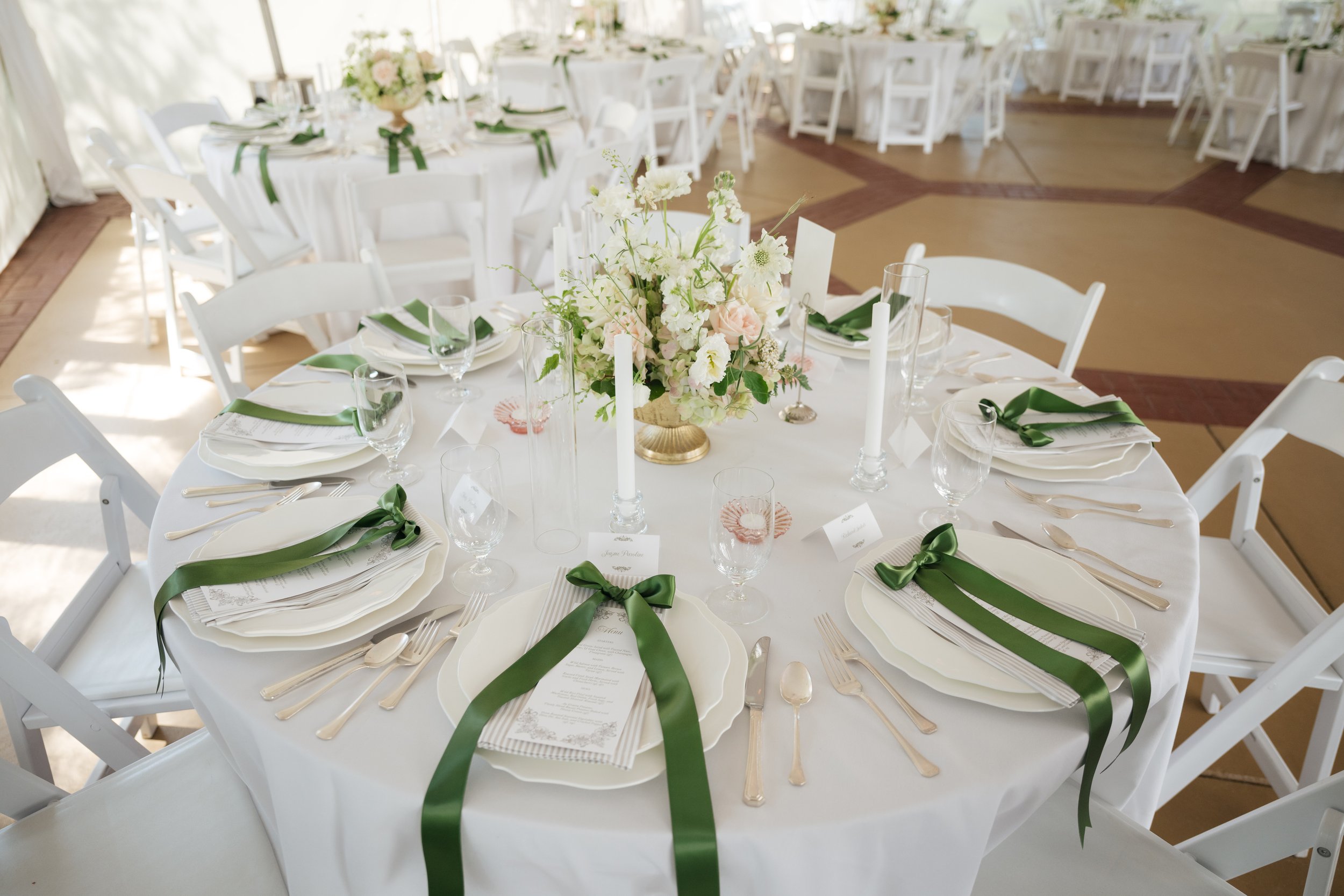
Palette 02: Ivory Neutrals
Ivory, oat, mushroom, espresso brown - these neutrals are my secret weapon for timeless photos. They never go out of style, so they are the number one choice for many couples.
There is a good reason for this. This elegant wedding color palette creates a soothing atmosphere in a room bathed in warm whites and soft texture. For instance, imagine raw-silk linens, unbleached napkins, and garden florals in cream and ecru. It is a dreamy setting that will look amazing both in real life and in photos.
In my experience, the most timeless galleries I have delivered are almost all neutral, letting a pop of color shine as an accent rather than the main event. So, if you want your photos to feel just as relevant on your twentieth anniversary as they do today, this is the palette I reach for again and again.
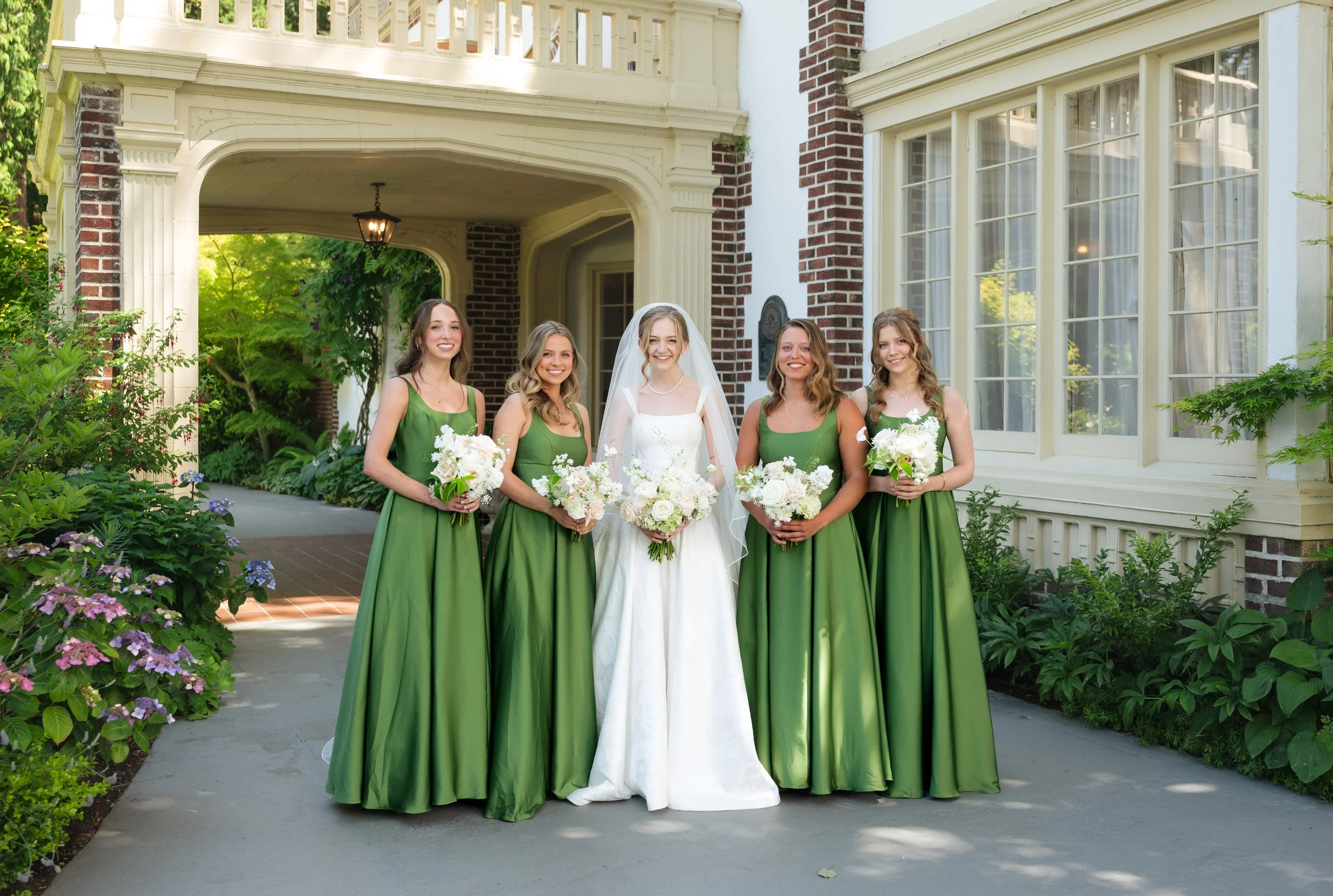
Palette 03: Pastel Garden
Pastels, as seen in lush gardens, are romantic, fresh, and incredibly elegant. Soft pink, olive green, butter yellow, and other muted pastel shades come together beautifully without making the celebration feel overly themed or too delicate.
You can incorporate this elegant wedding color palette along the aisle, and you can continue the flow at the reception through the linen, stationery, and floral arrangement. Finally, you have a refined and relaxed setting, resembling an intimate garden at a private estate.
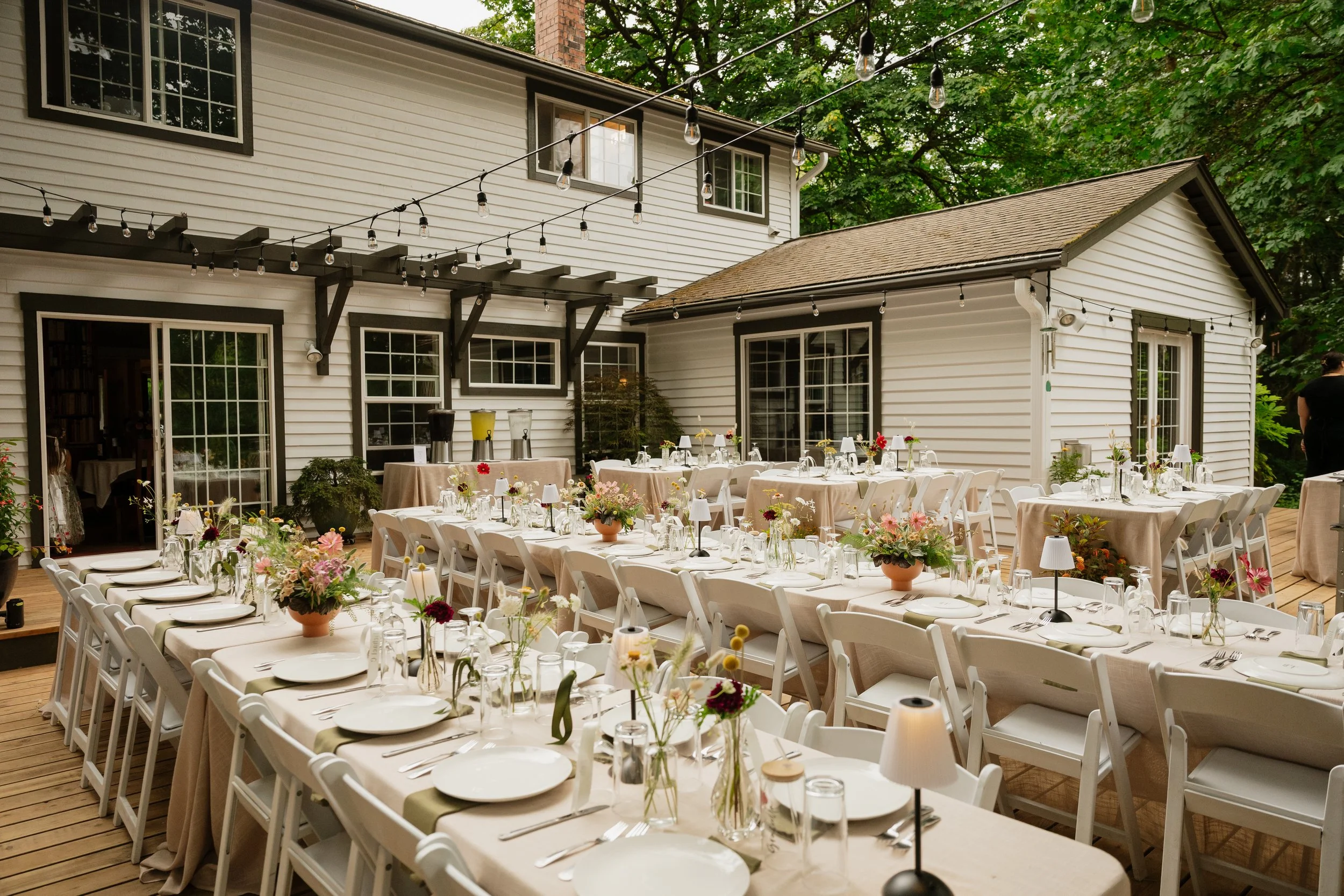
Palette 04: Muted Earth Tones
I should not forget to mention the muted earth colors, such as terracotta, sage, sand, and ochre. These are the tones that make outdoor weddings feel like they belong to the land.
Moreover, earth shades look incredible at golden hour, and they keep their richness as the sun sets and the string lights come on. I cannot tell you how many times I have been inspired by a muted earth-tone tablescape at sunset or florals that echo the rolling hills around a venue.
Palette 05: Modern Monochrome
Now, for the couples who know exactly what they love and are not afraid to show it - modern monochrome. Take, for example, an all-blush celebration, a ballroom shimmering in champagne, or a wedding washed in dove grey. This is not something that many couples do for weddings, but that does not mean you should not consider it.
Going monochrome is bold, but it lets the real stars, your closest people, shine in every frame. It is a statement, and it always feels intentional, harmonious, and totally unforgettable.
In short, this is an elegant wedding color scheme for couples who want their celebration to look and feel like nothing else.
Why These Palettes Photograph So Well
When I discuss colors with my clients, they are eager to know why I recommend some tones over others. As I said before, what you see in real life is not the same as you see in photographs. That is why it is crucial to find the colors that will bring you exactly what you envisioned.
The elegant wedding color palettes I discussed above follow some fundamental rules, which is why they are expected to work wonderfully well in wedding photos. More precisely:
They are built to look gorgeous in warm light, so skin tones glow and every room feels like a dream, both in person and on camera.
Each palette sticks with just two or three core tones. This keeps everything feeling cohesive and elegant, instead of overwhelming in photos.
Neutrals are always the foundation, with accents added in for just the right amount of character and depth.
You should remember that a great palette is a love letter - not just to each guest, but to the room itself. When you choose well, your colors do not just look good on the day. They grow richer each time you revisit your photos, never feeling dated or trendy.
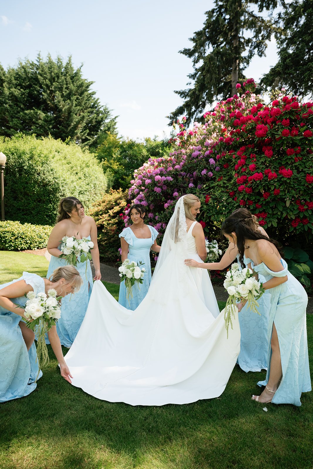
Matching Your Palette to Your Photographer’s Style
One thing that is often overlooked but should always be taken into account is that your color palette needs to work with your photographer’s style.
Some of us are all about light and airy, others live for those rich, moody tones. If you adore vibrant purples and bold yellows, find a photographer who loves color. On the other hand, if your heart goes out to taupe, cream, and dusty blue, look for someone whose portfolio is soft and luminous.
Whatever you do, do not try to force a photographer into a different look. Instead, find an artist whose eye already matches your vision.
The Lasting Power of Thoughtful Color
At the end of the day, the most stunning, elegant wedding color palettes are the ones that feel at home in your venue, flatter everyone in the room, and, most importantly, photograph beautifully. The best colors are rooted in neutrals, accented with care, and chosen to last, not just for this year, but for every anniversary to come.
My greatest joy as a photographer is delivering a gallery that feels as timeless, authentic, and elevated as the memories you made.
For more advice on wedding photography, check out my other blogs.
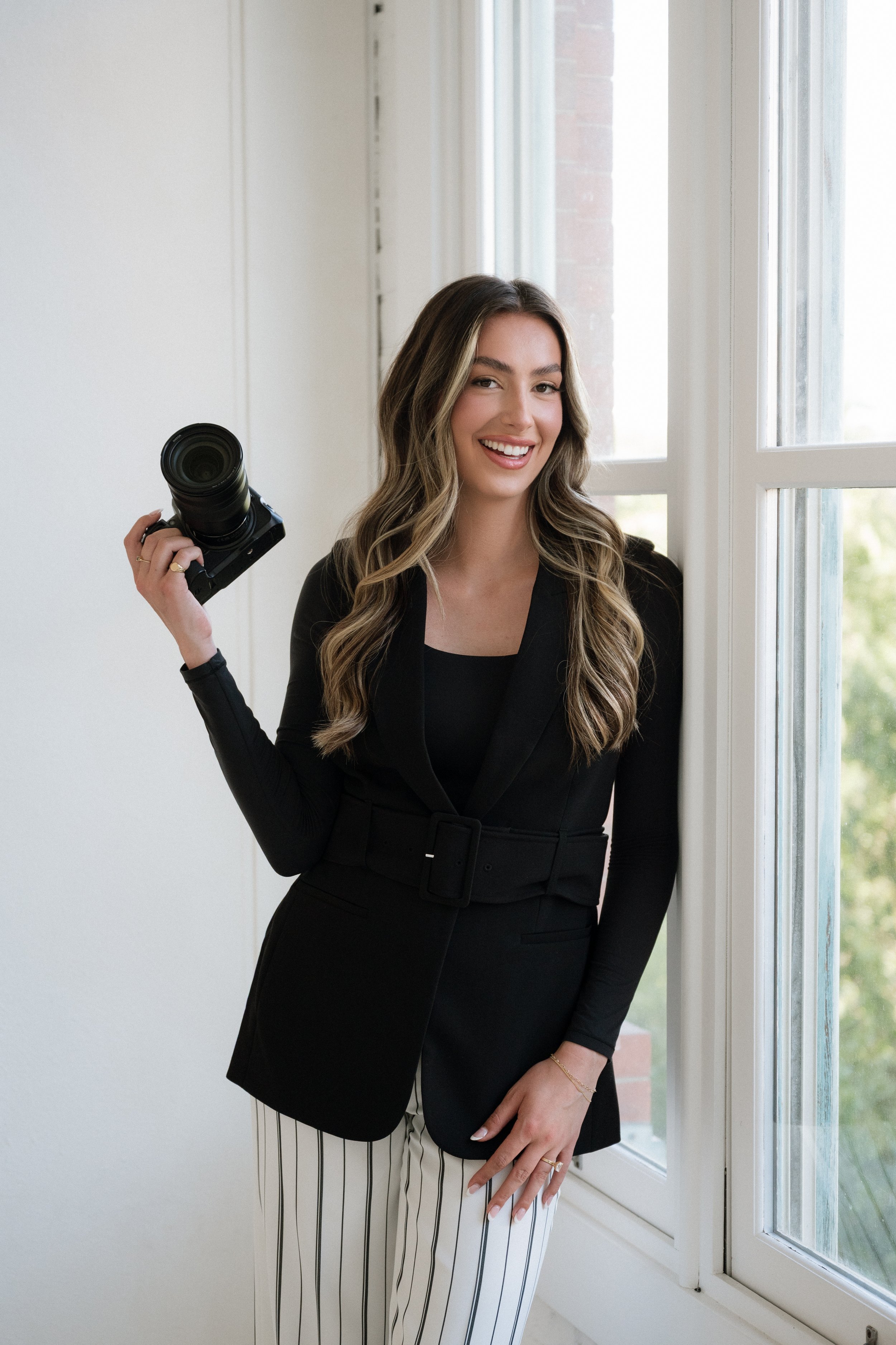
Hi! I’m Isabella!
I’m Washington State wedding photographer based in the South Sound, specializing in timeless, editorial imagery for couples who want their day documented with intention and care. I work across Washington State and beyond. If you are planning a local or destination wedding and want a photographer who will bring genuine passion to every frame, I would love to hear from you.